views
- Green and red are on opposite sides of the color wheel, so they complement each other. Just avoid matching super vibrant shades, as that combo can be harsh.
- Use neutral colors like white and beige to make green stand out.
- Blue and yellow are next to green on the color wheel, so the three make for an analogous and calming palette in any space.
- Neutral greens can make difficult colors like orange and purple shine, as long as the shades are deep enough.
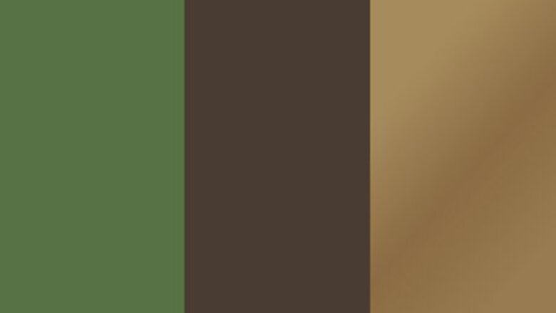
Olive Green, Brown-Gray, and Brass
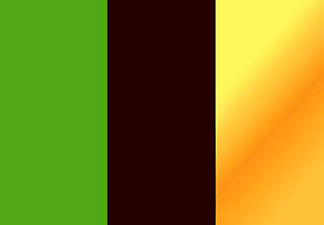
Green and brown plus gold looks more rustic. Adding a spruce of gold to the mix can change the tone of green and brown. Unlike the richer, more woodsy feel of deep green on deep brown, choosing more gold accents can keep a space’s pastoral vibe without feeling overwhelmingly outdoorsy.
Forest Green, White, and Black

Use these basics to make green the star color. Black and white always look good together. Adding a green to this combination of neutrals will highlight its hue and provide a sense of modernity and playfulness to any room.
Coral and Country Moss

A salmony coral hue and green are complementary. Because red is the opposite of green on the color wheel, these two colors balance each other well. While pairing a primary, vivid red with green may feel too flashy, using lighter red shades like bay coral are extremely visually appealing.
Teal, Pear Green, and Banana Yellow

These colors are analogous, which makes them pleasing to the eye. Because teal blue, yellow, and green are situated directly next to each other on the color wheel, they make for a unified color combination. When you look at them side by side, you'll see how nicely they flow together to create a lively, sweet aesthetic (perfect for a bright breakfast nook!).
Peach and Lime Green

Pair peach and lime green together to create a beachy look. This tropical color combination offers a laid-back, coastal take on the traditional complementary colors. Lime green is both fresh and playful while peach is equally citrusy and offers a sort of sandy backdrop.
Gold and Forest Green

Soft greens are perfect accents to brighter colors, like gold. Because green is so diverse, it makes for a great secondary shade to royal yellows and colors with more brightness and saturation. Use this color combo when you're designing any room, and you'll love the results.
Jade and Natural Tan

Use neutrals to make cool greens pop. Green is gorgeous in its own right! Combining green with neutral colors like whites, grays, and soft tans can really draw out the vibrance of your chosen green, making your room feel more regal.
True Green, Rhumba Orange, and Kimono Violet
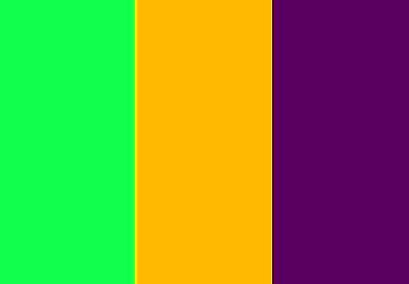
Dress up a cozy living room with true green, warm orange, and violet. Because the vibrance of a true red and green pairing can feel a little over the top, you can "split the difference" so to speak. Skip the red, and instead choose one hue that's a little brighter (warm orange) and one that's a little darker (violet). This'll create the same complementary effect, but without the garish side effects. Plus, the fact that orange, purple, and green are the main secondary colors mean this combo will flow together even better.
Indigo, Jacaranda, and Beach Blanket Green

Pair blue and green for a calming effect. Since blue and green are both cool colors on the same side of the spectrum, their crisp hues combined create a soothing look. Turn any room into a safe haven using this refreshing color combination.
Oleander and Sage Green

Match pink and sage for a luxurious aesthetic. Because soft pink and sage are both shades of red and green, their combination will be less obvious, but just as flattering as their primary counterparts. These two colors together invoke a sort of floral elegance and would make for a graceful bedroom palette.
Light Green, Elf Green, and Clover Green

Pair green with other greens for a monochromatic look. Color theory advises using different shades of the same color to make that color pop. Pairing a deep green with other, lighter values of green creates a harmonious, pleasing, and modern aesthetic.
Glisten Yellow and Aue Naturale

Use pale yellow and pastel green for a summery sunroom. If you want to complement the gorgeous view or plentiful sunlight in your room, pastel greens and soft yellows are the optimal choice. Putting these two side-by-side offers a subtle yet dynamic variance in shade and, because they’re next to each other on the color wheel, they’ll reflect light similarly.
Lime and Navy Blue
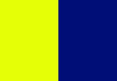
Using one bright shade and one dark can be striking (in a good way). By choosing a dark shade of blue, you’ll bring sophistication and depth to whatever room your painting. The brighter green accents then balance this color out with vibrance and levity.
Amber, Green, and Blue-Violet

Triadic colors can create a balanced palette in your home. When three colors make a perfect triangle on the color wheel, it means they're "triadic." By drawing two sixty-degree lines from one color (in this case, green) to its two its opposites (orange and violet), you’ll create a gorgeous balance of warm and cool tones, which is both exciting and soothing to the eye. Use triadic paint to expertly coordinate colors when decorating your bedroom or office!
White and Clover Green

Pair green with white to make a space feel bigger. White complements just about every color on the wheel. Its neutrality is perfect for making shamrock and other deep shades of green less sharp and striking. Cream and off-whites can also be paired with warmer greens to make rooms feel larger and more open.
Chive Green and Cayenne
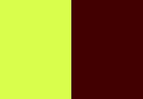
Green and brown provide a forest aesthetic. Green and brown are the two earthiest colors and pairing them together provides a natural sense of calm. Brown walls with green accents or green walls on hardwood floors make any room cozier.
Burgundy and Apple Slice

Greens and dark reds are a classic duo. While bright red and green together are forever associated with Christmas, softer greens with more violet-red accents give rooms a vintage, even sultry flavor.
Teal and Aquatic Mist

Teal and seafoam together remind people of the ocean. Two harmonious shades of blue and green, these colors together resemble an ocean wave. This combo manages to combine a calming and beachy vibe with a feeling of real elegance; it's perfect for a study or guestroom.
Pine Green and Pale Blue

Lighter blues add gentleness to green. Worn, flatter blues against a green backdrop provide a sense of sentimental nostalgia. While pale green walls are better for rooms with lots of light, dark greens make studies and quieter spaces feel more relaxing and homely.
Hibiscus and Belle Grove Sorbet

Let purple warm up your neutral green. Just like green is the epitome of earthy, purple is completely majestic. When paired with pale green, it purple shades really shine. Specifically, fuschia and magenta-ish accents do a great job of making a room pop while still keeping the feel cool and calming.



Comments
0 comment