views
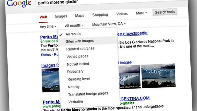
New Delhi: With the view to make its search results pages more engaging, Google has come up with a new design. Now if you search about anything on Google, you will find a new simpler and cleaner design on the search results page.
The new design apparently gives users a bit more breathing room and puts more focus on the answers that users look for, whether from web results or from a feature like the Knowledge Graph.
The advanced tools that you are used to are still there. The search engine giant has shifted the tools menu to the top of the screen. Users just need to click on "Search tools" on the top to filter or drill down on results.
Earlier, the advanced tools for reshuffling search results into specific categories, such as news, images, blogs and video would appear to the left of the search results.
"We've been working on ways to create a consistent search experience across the wide variety of devices and screen sizes people use today. We started with tablets last year, got it to mobile phones a few weeks ago, and are now rolling out to the desktop," said Jon Wiley, Lead Designer, Google Search, in a blog post.










Comments
0 comment