
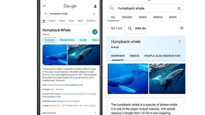
Google search for Android and iOS smartphones is getting a new design, and the update is rolling out in the “coming days.” The software giant explains that the latest design will have more clarity and a better focus on the search query with bolder texts and a cleaner interface. Google also shared an image of the upcoming design where the knowledge graph has a white background instead of a blue finish. The new design also puts more information higher up the page that reduces some visual clutter, to allow users to access quick information without forcing them to scroll down too far.
Aileen Cheng, who led the redesign of Google search for mobile devices in a blog said that the team wanted to take a step back to “simplify a bit so people could find what they are looking for faster and more easily.” Speaking more over the design, she adds, “Rethinking the visual design for something like Search is really complex. That’s especially true given how much Google Search has evolved. We’re not just organising the web’s information, but all the world’s information. We started with organising web pages, but now there’s so much diversity in the types of content and information we have to help make sense of.”
Google says that it wants to increase the readability of texts by using larger and bolder fonts so the human eye can scan and understand Search results faster. The new font designs may also rollout to other Google apps for consistency. Similarly, the search page will now display edge-to-edge results design, making it easier for the user to see more results. Google will also minimise the use of shadows to lighten to the mood and tone of the page. Aileen also says that the team experimented with lots of colours to highlight what is more important. “They [muted colour tones] weren’t quite right, though, and ultimately the team focused on centring content and images against a clean background and using colour more intentionally to guide the eye to important information without being overwhelming or distracting.”
Additionally, the new design is said to be “bubblier” and “bouncier.” The company says that the redesigned Google logo has a lot of roundness to it. As mentioned, the redesigned interface will rollout in the coming days.
Read all the Latest News, Breaking News and Coronavirus News here


Comments
0 comment