views
Drawing by Hand
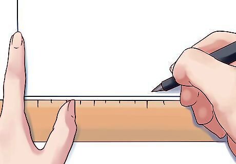
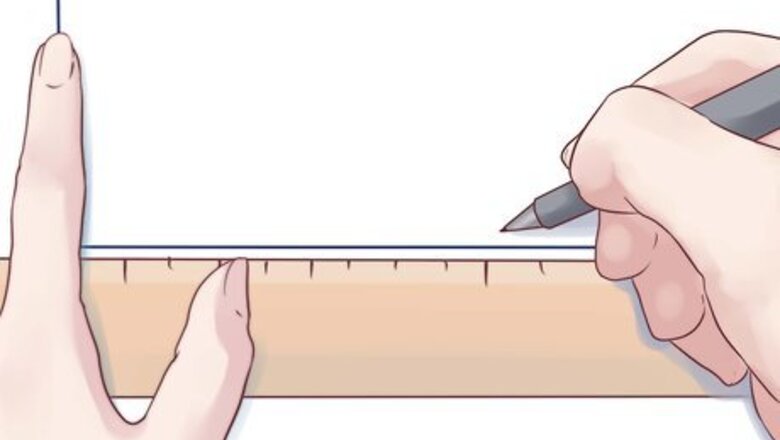
Using a ruler, draw out the basic axes. These are the vertical and horizontal lines that form basic outline of the histogram. If you have trouble making the right angle where the axes meet, go ahead and cheat: use a corner of a sheet of paper!
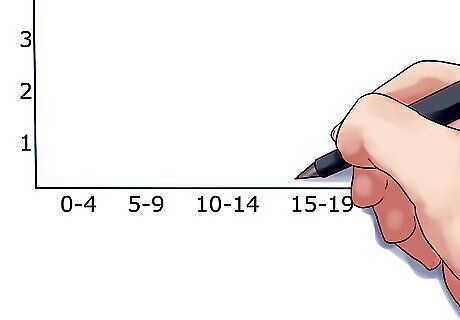
Measure out the groups. In a histogram, the data is visualized in groups. These groups are evenly distributed, so you'll need to make set marks along your lower axis. For example: 0-4 apples, 5-9 apples, 10-14 apples, etc at 1", 2", and 3" along the axis.
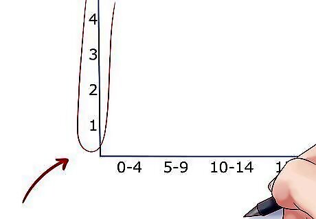
Measure out the vertical axis. The vertical axis in a histogram is always for frequency. What measure of time is necessary, though, is up to your data of course (but the numbers will still need to be equally spaced). Just be sure to leave extra room at the top to make your chart easier to read. If the upper limit of your histogram is 54, for example, you should make the highest number on the axis 60. If the frequency doesn't start until a fairly high number, you can cut out many of the numbers below it. For example, if the first frequency is 32, you can start the chart at 25 or 30.
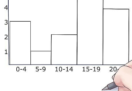
Draw the bars. Draw the horizontal top line for each interval or group lightly, at the level that data was measured. Then, draw in the bars centered over the data point they represent. Make sure the bars are even and the same width as each other. Generally, histogram bars are supposed to touch, but if you have no results for a particular group, then don't worry about it.
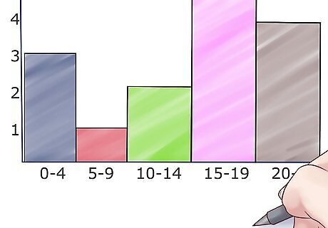
Add some color. Add different colors to the histogram rectangles with colored pencils, markers, or crayons to help differentiate among the intervals.
Using Excel
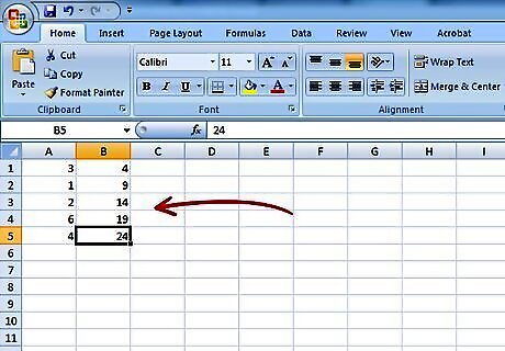
Fill out your data. In an open Excel document, fill the second column with the "bins", or data groups that you want (20/30/40, 0/5/10/15, etc) with one group per cell. Fill the first column with the frequency of results for that group (called the grade), or the levels that you want the bars for that group to be at.
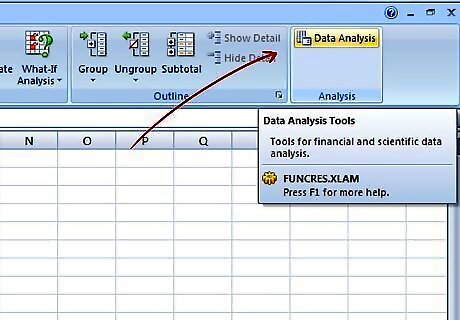
Do a data analysis. Click Tools → Data Analysis. This is not always a standard feature in Excel so you may need to install it using the Add-ins option.
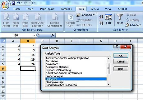
Select histogram. Select the histogram option in the Data Analysis menu and then click OK.
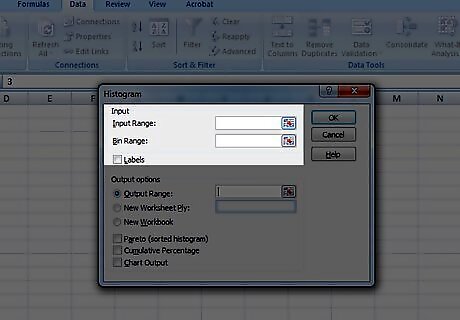
Adjust your input and bin ranges. You will need to use the menu to select which column is which.
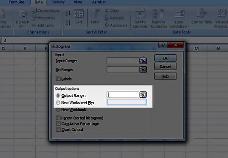
Select chart output. Select the chart output button and then press OK.
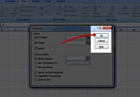
Done! Enjoy your chart. Don't forget to save it.
Using an Online Program
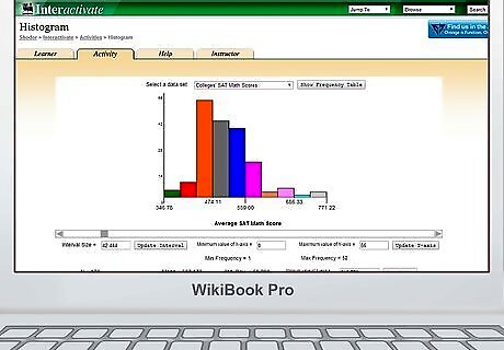
Go to a website which generates histograms. We recommend using this one.
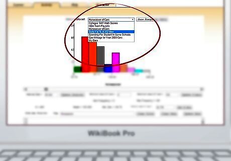
Choose a preset format. There is a drop down menu at the top of the chart that gives you a few basic sample charts that you can fill with your own data. Alternatively, you can build one completely from scratch.
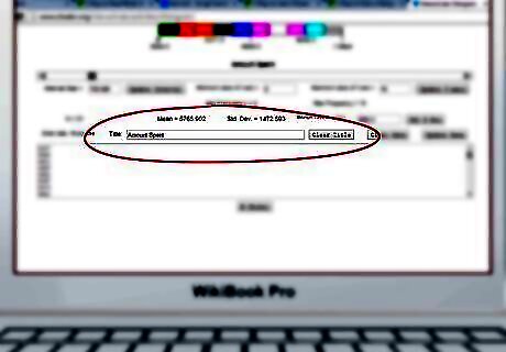
Name the chart. You will see a box labeled "Title" towards the middle of the page. You should title your chart there.
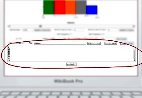
Enter your data in the box at the bottom. You will see a large box below the title bar, towards the bottom of the page. Enter each data point that you have, with one data point per line (so...5, 5, 5, 10, 10, 15, 15, 20, 20, 25, etc).
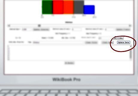
Click Update Data. Click the Update Data button above the data box.
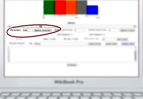
Adjust the frequency. The chart should automatically adjust to your data, but you can also manually set the interval size and the maximums and minimums for the axes.
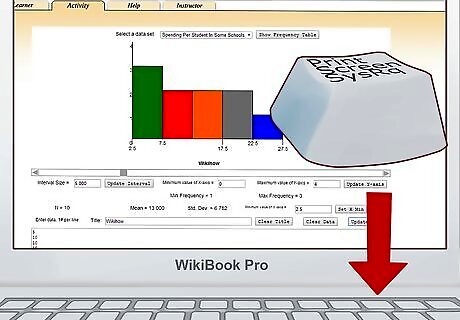
Print or save your chart. Use the print screen function on your keyboard to take a picture of the completed graph. Paste and crop the image in MS Paint or whatever basic image software came with your computer. Save the image and print it if you want to.




Comments
0 comment