views
Gathering Data
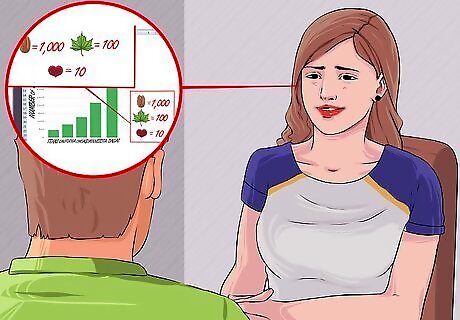
Pick a source for the data your pictograph will represent. You can collect your own data by interviewing people or counting items, or you can use data that has already been collected. Gather information from online sources to collect data on a certain event. Ask friends and family to respond to your question and collect data from people you know.
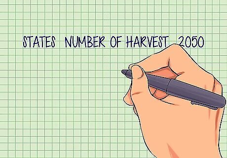
Make a list of all the data you have collected. Compile all of your data and numbers into a list. Organize your data into a table with each item labeled and explained.
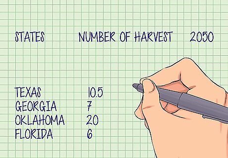
Review your numbers. Make sure that you have collected enough information to answer the question or present the information that you want your pictograph to represent. If you are collecting information on states, make sure you have collected data from many different states to accurately represent your data.
Choosing Symbols
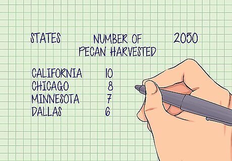
Write down what your pictograph represents. Write a short description of what people will understand by looking at your pictograph. The description will help you determine what symbols you should use and make sure you’ve made the pictograph correctly. For example, "The number of pecans harvested in different states in 2050.
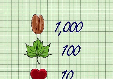
Assign values to symbols. Set a numerical value that is represented by a particular picture. Using whole numbers such as 10, 100, or 1000 are good starting points. Use different pictures represent higher or lower values. One pecan could equal 1 million pounds. Use fractions of a picture, such as half a pecan, to represents parts of a whole. Half a pecan equals 500,000 pounds.
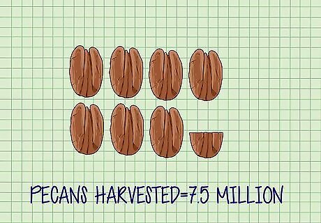
Match your data to your symbols. Go through your list of data and determine what pictures you need to represent each group of data. Write a note that tells you what you will draw for each data point you collected. If you know 7.5 million pecans were harvested in Georgia, you would draw 7 and a half pecans.
Creating a Pictograph
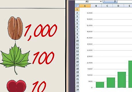
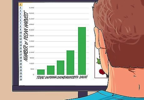
Decide if you will draw or print your pictograph from a computer. A pictograph can be made with the help of computer programs such as excel. Drawing a pictograph by hand gives you unlimited possibilities for creativity. Making a pictograph on excel is an easy way to create a professional looking graph. Input your data into an excel spreadsheet. Select the data and insert a bar graph. Click on the graph and select "Fill Options." Select "Picture or Texture Fill Options" and choose Clip Art as the source of your image. Click "Stack" to change the bar into pictures.
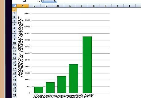
Draw and label the axes of your graph. A pictograph is a type of graph and will have labels on the side and below to tell what is being represented. The axes of a graph are a vertical and horizontal line that serve as an outer boundary or margin for the graph. Label one axis with the category of the data that was collected, such as “States” Label the other axis with the type of data collected, such as “Number Pecans Harvested”
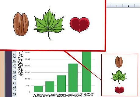
Draw symbols on the pictograph. Using the data table you created, fill in the pictures for each category of data. Draw the corresponding numbers of each symbol to represent the numbers in the data you collected. Be careful to use the right symbol or partial symbol to accurately represent each number.
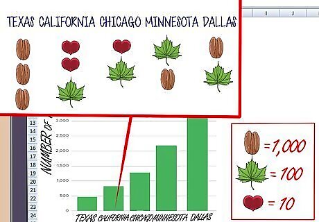
Label each category of data. Under each column of pictures, write the source of the data. For each state where monarchs were seen, you would write the name of the state under the pictures. You can also write the number that is being represented by the pictures to help make the pictures more concrete and easier to understand.
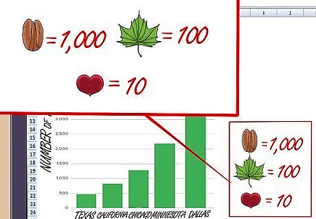
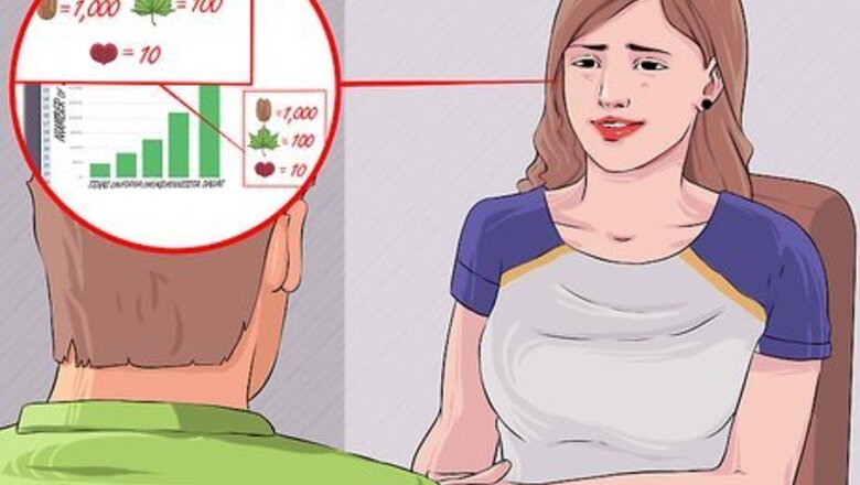
Include a key with your pictograph. In the corner of your pictograph draw a key that tells the reader of the pictograph what each picture represents. Make sure that each symbol used in the pictograph is represented on the key. If you used partial symbols, such as half a pecan, define how much the partial symbol represents. Label the key so readers know it is the key and not an additional category of data.
Use your pictograph to explain your data. If you are giving a presentation or making a poster to describe data, pictographs are a quick way to present a large amount of data. A well made pictograph will give a person an easy way to understand and compare data at a glance







Comments
0 comment