views
New York: In the market for smartphones, Microsoft's Windows Phone 8 system is barely there. It's dwarfed by Apple's iOS and Google's Android systems in both attention and sales.
But over the past few months, I have come to appreciate many of the software's innovations, which rivals would be wise to consider. More features are coming through an update that Microsoft is expected to showcase at its Build conference in San Francisco next week.
By no means is Windows Phone 8 perfect. Despite the "8" in the name, it is actually a second-generation system with room to grow. Although its app store is getting bigger, there are still annoying gaps, including the lack of apps for my bank and for a wine-recommendation service called Vivino. I'll expand on the shortcomings later.
First, I'll point out that Windows Phone 8 is not the same as Windows 8, the operating system for tablets, laptops and desktops. Although the two share design elements, apps for one won't work on the other. But both emphasise touch-screen controls, making Windows 8 awkward on traditional computers with keyboard and mouse controls, at least before some promised improvements that Microsoft may also elaborate on next week. Even on touch-screen computers, it feels disruptive having to reach your arm out to move a cursor.
Windows Phone 8, on the other hand, works well because the device is already in your hands. Touch seems more natural.
Compared with rivals, Windows Phone has a simpler interface. On Apple and Android devices, apps quickly fill your home screen, so you have to swipe left or right to access second, third, fourth or fifth home screens. On Windows phones, there's just one home screen, which you can scroll down if you need more room for apps. For apps you use less frequently, just swipe from the right edge for a complete, alphabetical listing.
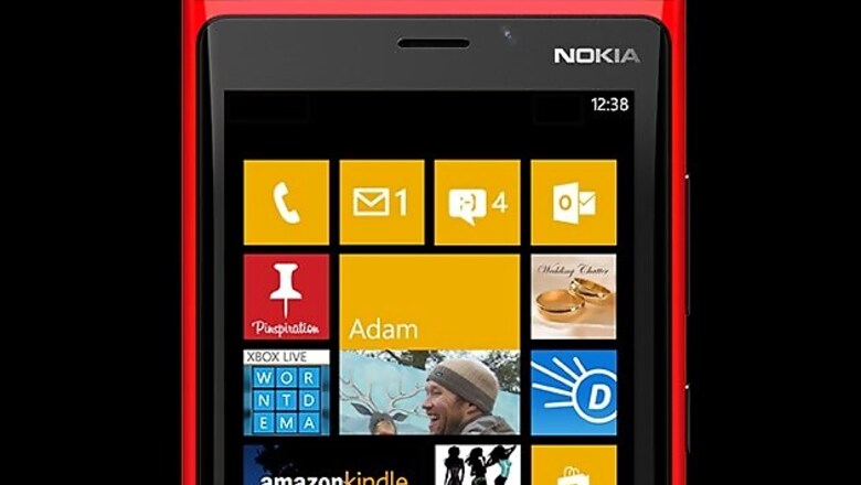
Icons, known as tiles in Windows-speak, come in three adjustable sizes.
Important apps can extend over two columns in a large, rectangular tile. These aren't the static icons you find in rival devices, though. Facebook's tile offers the latest notifications, while AccuWeather's gives you current conditions. The email tile offers previews of messages. There's no need to open an app only to learn there's nothing noteworthy.
You can squeeze two medium-size tiles in the space of a large one and four small tiles in the space of a medium one. You're not stuck with one format for all your apps. I rarely make phone calls anymore, so the phone tile is small. I check the weather a lot, so that's at maximum size.
Apps can also have multiple tiles. You can create separate tiles for each email account, for instance. You can create tiles for groups you follow on Facebook and for places you go to often using the Here Maps app. Think of them as shortcuts to specific tasks within apps.
Meanwhile, Windows Phone's People app goes beyond the typical contacts app. It's more of a hub for messaging and social networking. Instead of seeing just phone numbers and email addresses next to your friend's name, you get his or her latest posts and photo albums, plus your chats and call logs.
Through the tiles and the People app, Windows Phone brings content to you rather than making you hunt for it by bouncing from app to app. It'll take time to get used to the Windows interface, but it feels natural over time. Microsoft benefits from seeing what Apple and Google already have done with their systems - and finding ways to improve that.
Unlike Android, Windows adapts to phones with larger screens. Those devices get a third column of tiles, and contact lists fit in more information. With Android, text and images simply get bigger on larger screens, without actually fitting in more content.
On Windows, you can download mapping data for the entire country ahead of time, so you can get directions while offline. That would have been handy during the many times I've been in the subway without cellular access - and without a clue about how to get to my destination.
Parents, meanwhile, will appreciate a kids mode. Kids are allowed only on pre-approved apps and can't muck up the rest of your phone. Samsung will have that in its upcoming Galaxy S5 smartphone, but it's not a feature that comes with iOS or Android.
So why won't I ditch my Android phone yet?
Windows Phone still has kinks to work out. For instance, it doesn't know how to handle the extra layer of security I have on my Facebook account. I require a six-digit code sent to my main phone whenever I access Facebook from a new device. Rather than allow me to enter the code, Windows gives me an error message. I had to turn that security measure off.
Windows Phone also could use a central, pull-down hub for notifications, the kind you get with iOS and Android. Now, notifications appear on individual apps or tiles. And while it's great that I can make tiles smaller to save space, I wish I could simply group apps into folders, without having to install a separate app, Nokia's App Folder, to do that.
Some of my wish list might be fulfilled in the upcoming update. Microsoft has said it will add several features aimed at corporate use, including VPN support for accessing work networks securely. I look forward to hearing what else is coming.
Even with feature improvements, though, my biggest hesitation is Windows' limited app selection. You can count on most of the major services being there, something that wasn't the case a year ago. But now and then, I run across gaps.
The openings have left room for outside parties to step in with fishy alternatives. There's an app called "Google Maps," for instance, from something called "Clarity," but there's no clarity on how well it matches Google's own offerings on iPhones and Android devices. Meanwhile, Microsoft stepped in to create an app for Facebook, but a search produced several others. I had inadvertently used one of them - until it asked for money.
In the early days of Android, I watched jealously as the best phone apps went to iPhones first. Android has largely reached parity. Windows users are now the ones who must wait.


Comments
0 comment