views
New Delhi: Popular cross-platform messaging app WhatsApp is on an update spree. After introducing the much-awaited voice calling feature, WhatsApp has now revamped the app for Android with a new design. The latest WhatsApp build (Version 2.12.41) that brings with it a new layout design and fresh icons, among other changes, is currently available only on the company's official website.Users can download the latest APK file from the official site, install it manually and get the redesigned WhatsApp activated on their phone. The new version of the app is yet to make its way the Google Play store. "The update requires no new permission," says the app during installation. While some of the design changes are noticeable, others have undergone a subtle change. Here is a list of changes the new version of WhatsApp comes with.1. The taskbar on top is merged with the Calls, Chats and Contacts tabs with a green-coloured band running in the background. The new version has dropped the old familiar green for a new shade. Also, the taskbar (with WhatsApp and its icon on the left, and the search, compose message icons, and the three vertical dots on the right) collapses as you scroll down, leaving you with more room for viewing content.
 2. While the emoji icons remain the same, the tray holding them has a different colour. The new version of WhatsApp has an emoji tray in a light shade of grey. It was earlier in black.
 3. The little pointer arrows of the speech bubbles (containing the messages) have been tweaked a bit.
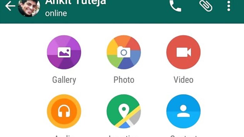
 4. Tap on the attachment icon in a chat window, and you will see the list of options - Gallery, Photos, Video, Audio, Location, and Contact - popping up with transition. Also these icons have got a facelift with the black colour in the background changed to grey.
 5. The recording button next to the message box now has a green background that highlights its presence. The message box also gets an overhaul.


Comments
0 comment