views
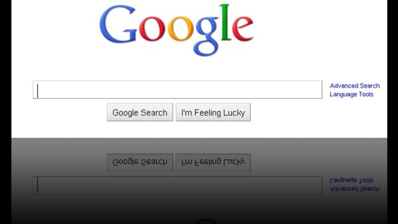
Washington: Google originally wowed internet users with its refreshing simplicity. The search engine's spartan, easy-to-use interface won over legions of internet users at a time when other search engines - or "portals" - had become cluttered and confusing.
Google still has a flair for the understated, but the search engine giant has also been tinkering a lot lately with new search features and interface enhancements that many feel border on distracting. Here's a rundown of what's happened to your Google search page recently, along with some tips on how you can get back the simplicity you might miss.
If you start typing into Google, and the search field suddenly flies up to the top of your browser window, you know you're dealing with the new feature that Google calls Instant. In essence, Instant attempts to update search results in real-time, as you type. So, for example, if you're searching for "ms word templates", the search results will be updated with each few characters.
Eventually, Instant figures out what you're searching for based upon what others have searched for, and this usually happens a few characters before you finish typing. At that point, you can stop typing and simply select the best search result from those presented.
You might find Instant's constant screen redrawing more distracting than helpful. If so, you can turn Instant off by searching for the faint "Instant is on" drop-down arrow to the right of the search field and selecting Off. You have to start typing, however, before that drop-down appears.
In an effort to make search results more personalised, Google introduced its Star rating system earlier this year. As a result, if you have a Google account and are signed in to the search engine, you'll note that each item in a list of search results now includes a hollow star to the right of the title.
Click that star, and it turns yellow. What also happens, behind the scenes, is that the item is added to your customised list of favourite sites and will appear at the top of a list of search results when the page is relevant to what you're seeking.
Here's an example. Let's say that after searching for "Hemingway," you see the Wikipedia entry for Ernest Hemingway among the list of search results, and you click the star next to that entry. The next day, you conduct a search for one of Hemingway's books - perhaps "The Sun Also Rises."
At the top of the list of search results will be a "Starred results" section, which will include the Wikipedia link that you starred the previous day. In this way, over time, the starred results system allows you to influence the search results that you see.
Want to disable starred search results? You'll need to click the Sign Out link in the upper right-hand corner of Google to sign out of your account.
Occasionally when you're searching with Google you'll see a scrolling box within the search results, with new search results appearing as you watch. This is what Google calls "real-time search", a feature designed to leverage constantly changing social networks such as Twitter and Facebook.
Originally rolled out late last year, real-time search has grown in popularity so much that Google recently rolled out an entirely new product called Google Realtime, which is devoted solely to capturing results from the web's premier social networks.
Google Realtime draws heavily from Twitter and Facebook to supply its search results. But Google claims that Realtime will also inherit some of the personalisation emphasis given to the mothership Google by allowing multiple ways to customise your search results. Among them is a conversations view, which allows you to follow the entire thread of a conversation on Twitter instead of seeing only a single entry, or "tweet." However, the customisation options are not readily apparent in the current iteration of Realtime.
If you thought that the community-minded Google would never try to monetise its main search page, you were wrong. A Google "Sponsored links" list now appears alongside - or at the top of - virtually every list of search results. Those sponsored links are, of course, paid advertisements.
In its official description of sponsored links, Google attempts to play down the commercialisation of its search results by pointing out that it filters ads so that only those that are most relevant to your searches will appear. Regardless, however, these sponsored links remain advertisements, and it's important to remember that they appear alongside your search results not because they are necessarily the most relevant to your search term but because they were purchased.
The Google Everything sidebar is another recent addition to Google that attempts to put more relevant search options at your fingertips. Consequently, the sidebar, which appears to the left of your search results, contains links to other Google repositories of information - including videos, discussion groups, images, news, maps, and more - that probably also contain relevant information related to your search term.
On the social web, though, the Everything sidebar has received as much criticism as praise. That's primarily because it's not possible to get rid of it.
If you long for the days when Google was not cluttering its search results page with lots of features that you never use, you're not alone. Search the internet, and you'll find a plethora of tricks designed to remove features that Google has added. These tricks mostly have one thing in common: they don't work.
There is one tact, however, that you can still take to get a no-nonsense Google page: use Google's mobile site. Although the site is designed to run on small mobile devices, like smartphones, it works just fine from your desktop or laptop as well. And it's refreshingly devoid of "stars", real-time search, "instant," sponsored links, and most of the other new features that might be making you long for the Google of a decade ago.


Comments
0 comment